Shaping an updated in-store experience for Run campaigns
- Article by
Mario Luca Stadelmann, Engineering and Production Management Lead
Luca De Curtis, 3D Polydesigner Specialist
Antonio Fazio, Campaign Spatial Design, Senior Lead
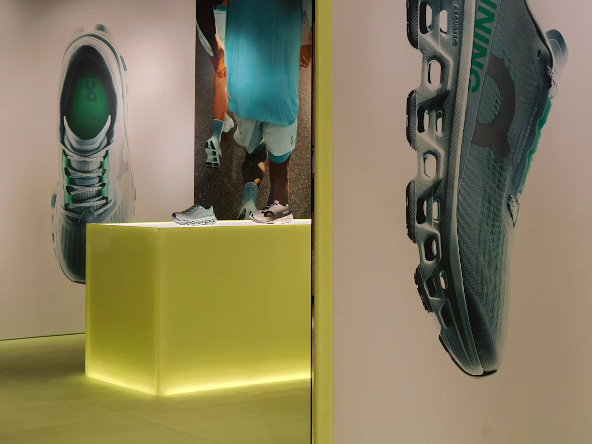
Global art direction is translated into immersive spatial storytelling through the work of Antonio Fazio, Luca de Curtis and Mario Stadelmann for On's FW26 Run campaign. The three walk through how the project came to life in retail stores globally.
What gave the initial inspiration for this project?
The initial spark for our FW26 Run campaign stems from a singular, powerful desire: to reclaim the physical and emotional sensation of running on clouds. This profound feeling serves as our core creative anchor for all Run campaigns. New identity, refreshed core assets and redefined spatial approach.
The concept behind this campaign was to establish a design language that can be reused across future Run campaigns. To achieve this, the system is built around a simple, clean geometric vocabulary, with rectangles and squares as the dominant forms.
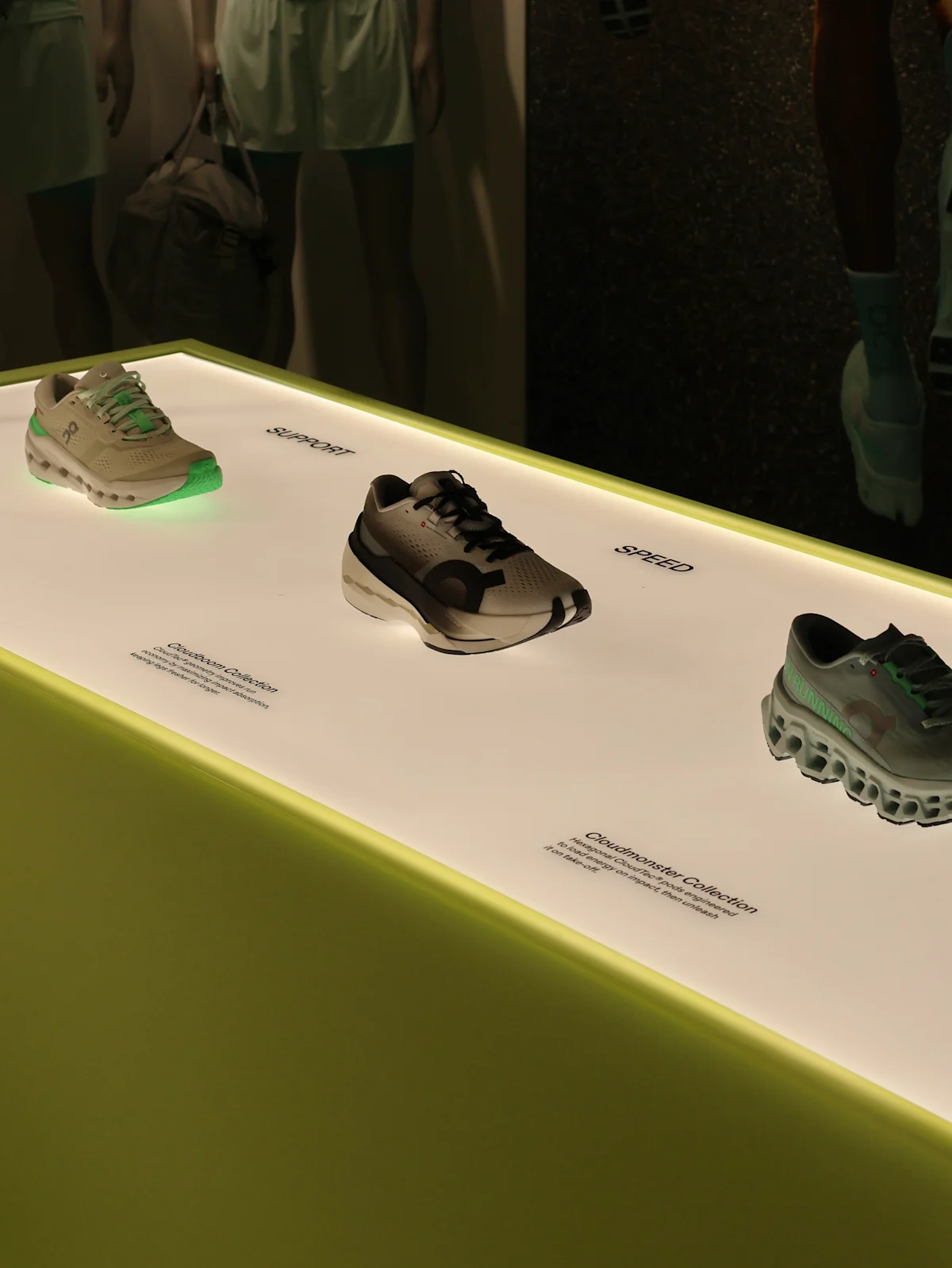
The objective is to align with our fresh Art Direction for Run by using illuminated lightboxes to give product displays a precise, engineered character, paired with transparent materials (such as acrylic panels) to create a deliberate tension between product and visual storytelling. This modular design language provides a consistent foundation, while remaining flexible enough to evolve in our different store layouts and from one campaign to the next.
What was the original vision and how did it evolve?
Our initial material narrative was heavily anchored in the fluidity and high-gloss impact of resin. We wanted the space to feel flooded with that specific texture. However, as we moved from concept to schematic design, we realized this direction created a friction with our core eco-conscious ethos. Good design must be holistic, and when factoring in the environmental footprint – alongside the constraints of lead times and budget - we recognized the need to pivot. We evolved the vision to capture that same striking visual weight but through materials that honored both our sustainability goals and our project timeline
Were there any bold design decisions you made?
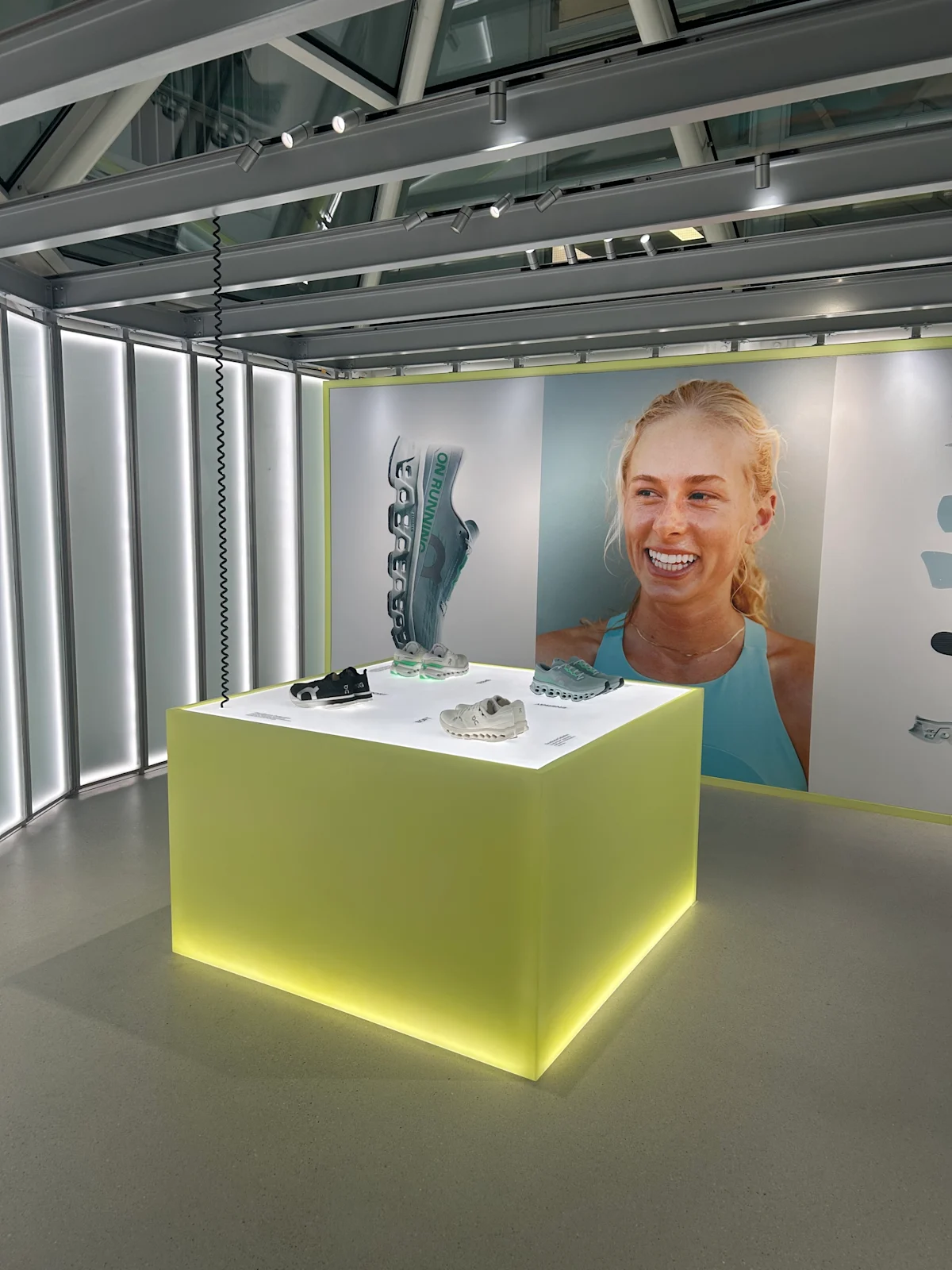
Introducing our brand’s signature high-voltage lime green into the spatial palette was a significant chromatic risk. A color that loud creates a very demanding dialogue with the existing architecture, which naturally varies from location to location. We had to be highly intentional with its application. In some footprints, we scaled the green back to act as a curated accent against a more neutral, grounding canvas so it wouldn't overwhelm the space. But in others, we leaned all the way in. We executed a complete spatial takeover - installing saturated green flooring to create a monochromatic envelope. The result in those locations was a highly immersive, experiential zone that completely separated the campaign from the everyday retail environment
How did you balance creative freedom with any constraints of the project?
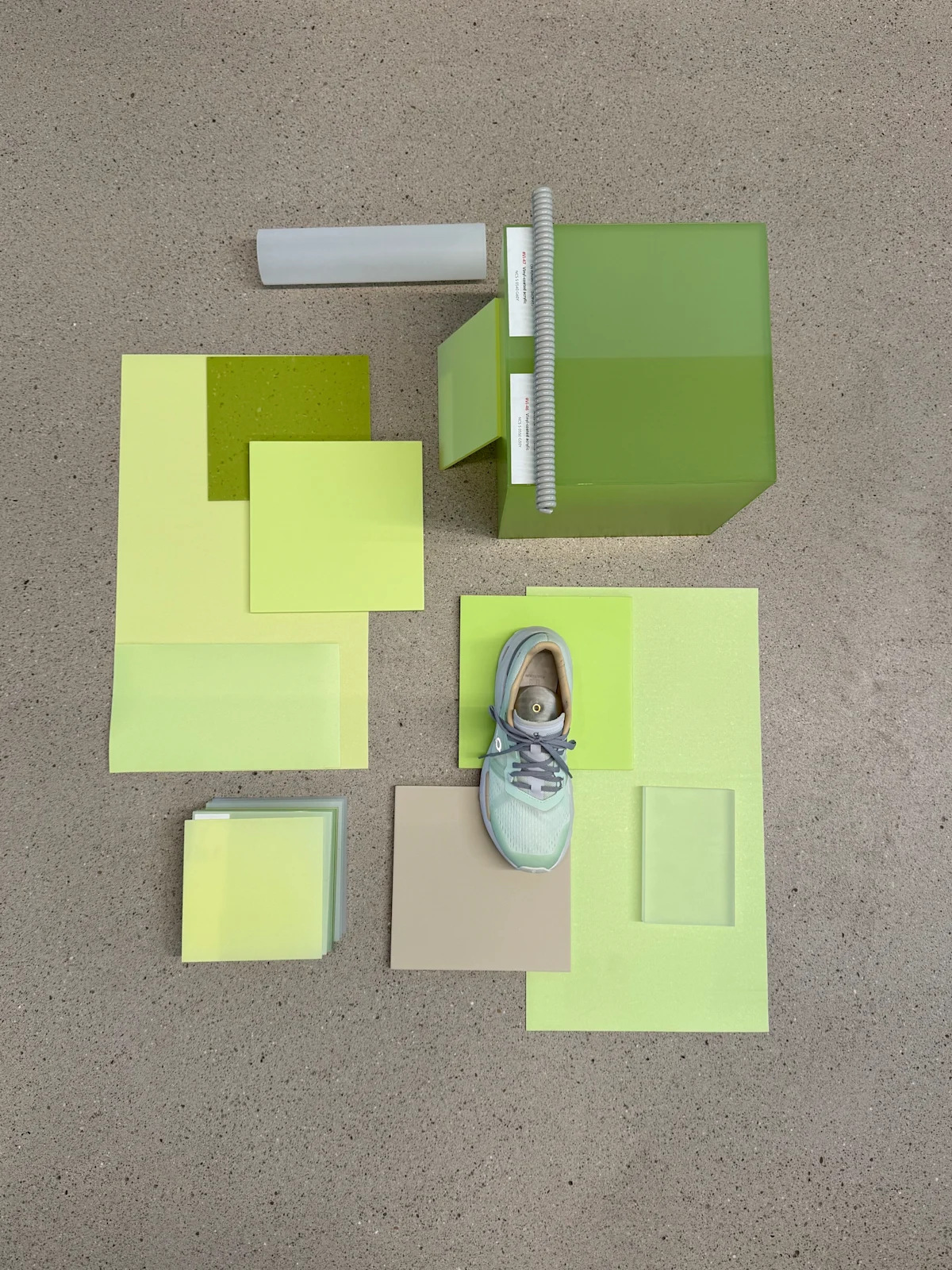
We always view constraints not as limitations, but as the framework for innovation. Our conceptual vision was expansive, but architecture demands reality. We had to engage in a very organic dialogue between our idealized aesthetic and the physical footprint of each individual store. Once we began the site-specific contextual adaptations, the constraints actually guided our hand - dictating the rhythm, scale and materiality of what we could successfully execute while maintaining the integrity of the original design intent.
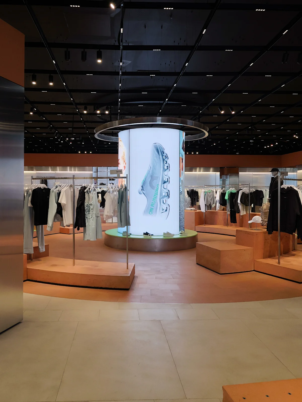
The circular podium at Regent Street is a good example (This one gives us headaches). While its geometry doesn't align with the FW26 design language, we chose to incorporate it into the activation after exploring several alternatives. The design system will remain the primary driver of the spatial experience, even if that means leaving certain permanent elements untouched in the future.
What have you learned that will influence your future work?
This project was a masterclass in color relativity. A hue never exists in a vacuum; it is constantly shifting in response to ambient light and adjacent materials. Moving forward, we’ll be much more aware of how a campaign’s palette will breathe within varied architectural environments, allowing us to engineer alternative design solutions much earlier in the schematic phase. Ultimately, it inspired a new spatial strategy: carving out dedicated, architectural 'voids' or isolated experiential zones within our stores. By controlling the environmental variables completely, we can craft unapologetic, fully immersive narratives without architectural compromise.
Establishing a clear creative direction for future Run campaigns brings greater consistency across all activations while simplifying both production and installation. It provides a strong, scalable foundation that can be adapted and expanded to the other product verticals as they are developed.
Was there any particular tool or resource that was important in the process?
Tactile exploration and spatial mock-ups were absolutely paramount. We relied heavily on physical sampling and building scale prototypes. Looking at a digital rendering or a standardized color code is never enough, because different material finishes - whether porous, matte or high-gloss - absorb and reflect light differently. A single color code can translate into entirely different visual experiences depending on the substrate. The prototyping phase was crucial; it allowed us to witness these material dialogues in real-time and meticulously calibrate the finishes before final fabrication.
We introduced acrylic structures with integrated lightboxes for both product and visual display. The objective was to explore how light could enhance the product, elevate the campaign visuals, and travel through the material to create a subtle, refined effect.
Designed as an immersive environment, the installation creates a dedicated space within the store where product and campaign imagery coexist seamlessly, enriching the retail experience without disrupting the customer journey.
Although the design system appears simple, its success relies on exceptional execution. Achieving the level of quality we expect requires meticulous attention to detail at every stage of production. The devil is in the details after all.