The ‘Zone Dreamers’ digital experience
- Article by
Kaique Amorim, Lead Creative Technologist
Jonathan Whitfield, Specialist UX/UI Designer

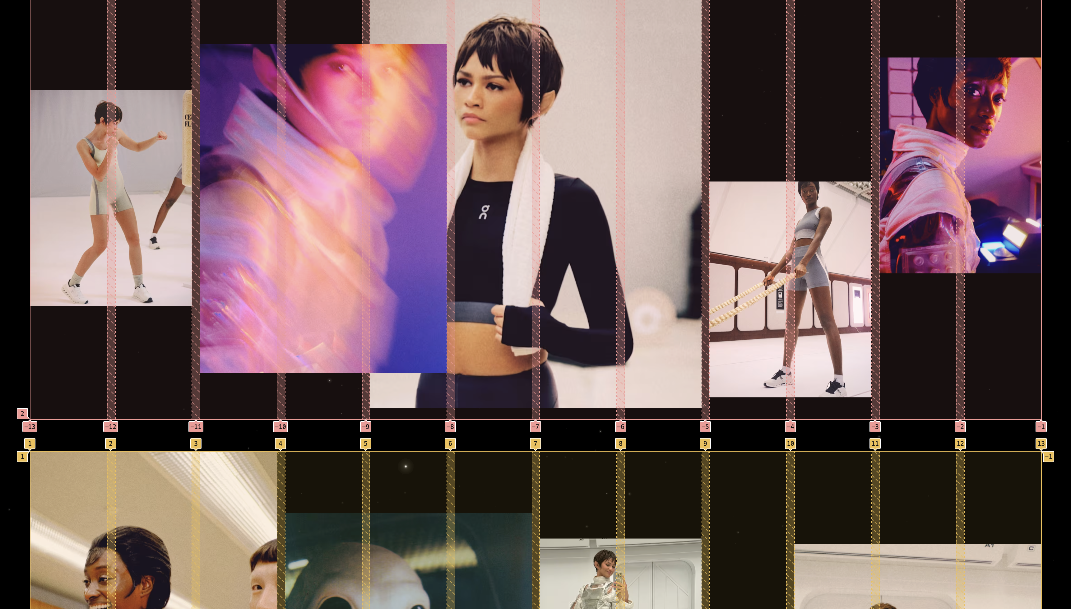
Zone Dreamers is our cinematic campaign featuring Zendaya as a protagonist on a mission through space. Kaique Amorim and Jonathan Whitfield walk us through the work of designing the digital experience for the campaign.
What gave the initial spark or inspiration for this project?
The campaign theme itself was already strong enough to spark a clear creative direction. Around that time, I was also experimenting with procedural space game ideas – things like generating starfields, glitching text and simulating movement through space. So mixing in a bit of that, along with some Interstellar-style visuals and classic Star Trek vibes, made the whole process feel smooth, fun and kind of like launching into creative orbit.
What was the original vision for the project and how did it evolve throughout the process?
The initial blueprint for the digital experience was a full-on microsite orbiting the trailer, complete with mission logs like interviews, behind-the-scenes content and editorial deep-dives. But as things evolved, we recalibrated the scope and opted for a streamlined single landing page – a kind of command center that delivered the whole experience in a tighter and more efficient package.
Were there any bold decisions you made that you were uncertain about? How did they turn out?
Absolutely – the devil’s in the details, right? You can’t talk about space without actually showing space. We wanted a reactive background that subtly shifts as you move the mouse, creating that sense of depth and motion. But the particles were way too complex to pre-render as video – the performance would’ve tanked. So we went with a real-time WebGL implementation instead. It was actually our first time integrating graphics tech like this into a campaign page. Definitely a bit of a leap into the unknown, but it worked – smooth and responsive, just like we hoped.
How did you balance creative freedom with the given constraints of the project?
The space theme really opened things up for us creatively, and we jumped in with a lot of energy, exploring all kinds of ideas, interactions and visual concepts inspired by sci-fi. It felt like tapping into a bunch of references and inspirations we’d been carrying for years. But of course, we had to work within some real constraints – like performance, timelines and making sure everything stayed true to the campaign’s core message.
What have you learned from the project that will influence your future work?
The art directors helped ground the project and keep things focused. In the end, it was about finding the right balance between creative freedom and staying on brief.
We learned a lot from this project, especially when it comes to new tech tools. As I mentioned earlier, WebGL is something we’re just beginning to explore, and this was our first real step into using it in a campaign setting. To simulate a sense of gravity and depth, we also implemented smooth, inertia-based scrolling, where different elements move at different speeds as you scroll. Since then, we’ve reused and refined this technique for other campaigns, like Loewe SS25.
Honestly, I could go on – this project really laid the groundwork for a lot of what we’re building now and plan to do moving forward.
Was there any particular tool, technique, or resource that were important in the process that you would like to share?
This project required a high-fidelity prototype because working with parallax effects, sound and motion design isn’t really feasible in Figma. So, instead of relying solely on design tools, all the rounds of design and art direction feedback were implemented directly in the code. This hands-on approach made it easier to fine-tune interactions and animations in real time.